Front page facelift

(This is a thread from Mizahar's fantasy role play forum. Why don't you register today? This message is not shown when you are logged in. Come roleplay with us, it's fun!)

Feel free to post all your Mizahar related discussions here.

Front page facelift

Postby Tarot on September 29th, 2009, 8:27 pm

I thought I'd start a discussion on this topic! See, I'm the kind of admin who wakes up in the morning and thinks, "backgrounds are too dark!", "the text is too small!", "the font is all wrong," and so on. Literally.

So, Mizahar's site design is a little unusual in some ways. It comes from a skin for an entirely different software (called Joomla) that was originally to serve as a portal before I coded one for phpBB. I made a ton of changes and this is the result. A lot of it is hand-crafted.

I'd like to hear your thoughts on the front page and what could be done to improve it. The front page is the only chance most visitors are willing to give us, so it needs more attention. Frankly, I'm not very satisfied with it right now - I think it's the ugliest page in the site for some reason, but I can't pinpoint why. Do you think:

1) Do we need more intro text?
2) Do we need larger text?
3) Do we need additional panels? If so, what should go in them? (I'm going to integrate wiki stats and latest blogs - halfway done)
4) Different colors/layouts/styles?
5) Would you like a second, optional skin that was more "standard"? Meaning light background, black text, more like a normal forum. You'd be able to switch between skins in the control panel.

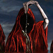
We could also discuss custom artwork. Eventually, I would like to replace the red forest with some custom piece of artwork. Other sites just rip off deviantart pictures and blend them together with photoshop, but I find that horribly cheap. I'd rather pay for quality artwork than do that.

But, as Goss pointed out before, I don't know what I want at all! What would you want in the header pic? And do you know an amazing artist for hire?
Tarot's thread tickets: sold out. Not accepting any more threads for the time being unless I promised you one. Sorry for the inconvenience!
User avatar
Tarot
May you live in interesting times
 
Posts: 2216
Words: 766317
Joined roleplay: March 23rd, 2009, 4:29 pm
Location: Moderation abilities game-wide
Blog: View Blog (11)
Race: Staff account
Office
Scrapbook
Plotnotes
Medals: 5
Featured Thread (1) One Thousand Posts! (1)
Extreme Scrapbooker (1) Being Tarot Award (1)
O RLY Decoration (1)

Re: Front page facelift

Postby Gossamer on October 17th, 2009, 7:50 pm

Okay... since no one has posted to this lonely little thread (which I was secretly thrilled about) I will give it a go and state my opinion in the hopes that someone will feel the need to jump in too.

1. I do think we need more intro text. As to what that is, I am wholly unsure of. It would be nice to perhaps pool the new users, but so far the only complaints people have is about dead links in the wiki and unfinished writeups therein. So, is this a high priority? I don't think so, but as we expand or maybe dive into more things... we should absolutely take a look at adding some more text to the front. I'd see some potential for Featured Items.. like threads, links to a project I'm going to start after my surgery in Nov (Free Custom Avatars.. first come first serve and requests.. so maybe a featured avatar image thats free to claim that I have produced myself - Yes I'm good enough if I just get off my lazy you-know-what).


2. No.. but truthfully I think sometimes the post text needs to be larger. I've looked around for how to change it, because honestly I have trouble differentiating different font styles with the way my screen shows it to small.. but thats just my thought on it... and its probably changable somewhere.. I just haven't found it yet.

3. Yes.. see #1. I'd like to see "Featured" Sections... a featured character each month, a featured thread, maybe even Featured Artwork or Writing thats not in thread form perhaps generated from the Writer's Workshop, though the latter might have to wait until we have Nano material to display or people start doing short stories, poems etc.

4./.5 I'm in love with the color scheme. It's easy to read, clearly visible, and I do totally enjoy it. I even like the trees on the front (but then again I made that!)... eventually? I wouldn't mind a blue scheme, but again I know its a lot of work, and time I'd rather see you use in the wiki development or maybe some other features. No no no we don't need a standard optional skin... those are just boring and no one would use them anyhow. I know my phone even reads the current skin nicely and its not one thats designed for phones...

Things you forgot to ask!

6. Yes! I'd like to see custom profiles with a write-on board and ability to add background, and images. I think people would really use them and that would sorta be the icing on the cake for us 'having it all' and 'having it free!'. And honestly, other than a totally flushed out (never gonna happen!) wiki, I'll be completely 100% satisfied and happy with the game for a few years design wise!


There... now peoples. Feel free to pipe in ... you know you have opinions.


Goss
Image
BBC CodeHelp DeskStarting GuideSyka
User avatar
Gossamer
Words reveal soul.
 
Posts: 21137
Words: 6356204
Joined roleplay: March 23rd, 2009, 4:40 pm
Location: Founder
Blog: View Blog (24)
Race: Staff account
Office
Scrapbook
Plotnotes
Medals: 11
Featured Contributor (1) Featured Thread (1)
Lore Master (1) Artist (1)
Trailblazer (1) One Thousand Posts! (1)
Hyperposter (1) One Million Words! (1)
Extreme Scrapbooker (1) Power Fork (1)


Who is online

Users browsing this forum: No registered users and 0 guests